

The App That Refuses to Change (And Why That's Exactly the Point)

In a world obsessed with AI, voice capture, and feature bloat — Things 3 just sits there, being simple. And we can’t stop coming back.
It’s 2026. Every productivity app now has AI assistants, file attachments, voice memos, collaborative workspaces, and probably a built-in therapist. Todoist has AI. TickTick has habit tracking. Notion has… everything.
And yet.
Here I am. Back in Things 3. Again.
This isn’t a review. It’s not a comparison chart where I tally up features and declare a winner. It’s just a genuine effort to understand something that’s been bugging me: Why does this app — one that hasn’t fundamentally changed in years — still feel like the gold standard?
The Case Against Things 3 (On Paper)
Let’s be honest. If you’re shopping for a task manager in 2025 and you make a feature checklist, Things 3 loses. Badly.
No attachments? ❌
No file uploads? ❌
No AI prioritization? ❌
No voice capture? ❌
No web app? ❌
No collaboration? ❌
On paper, it’s a relic. A beautifully designed relic, but a relic nonetheless.
So why do people like me — people who’ve tried Todoist, TickTick, Notion, Obsidian, Apple Reminders, and whatever new “productivity revolution” launched last week — keep crawling back?
It’s the Experience, Not the Features
Here’s what I’ve realized after years of app-hopping: Features don’t make you productive. Clarity does.
Things 3 doesn’t try to be everything. It doesn’t promise to “revolutionize your workflow” or “leverage AI to optimize your day.” It just… works. You open it. You see your tasks. You do them. You close it.
No friction. No decision fatigue. No wondering which of the 47 views you should be looking at.
There’s something almost meditative about it. The interface is so clean, so intentional, that using it feels less like “managing tasks” and more like having a quiet conversation with your own priorities.
The Simplicity Paradox
We say we want features. We say we need attachments, integrations, AI suggestions. But every time I switch to an app that has all of that, something strange happens:
I start managing the app instead of managing my tasks.
I’m tweaking filters. Setting up automations. Wondering if I should use labels or projects or both. Watching YouTube tutorials on “the perfect Todoist setup.”
And somewhere in all that optimization, I forget to actually do the things.
Things 3 doesn’t give you that option. There’s nothing to optimize. There’s just the work.
What an Individual Actually Wants
Strip away the marketing. Strip away the feature comparisons. What do you actually want from a task manager?
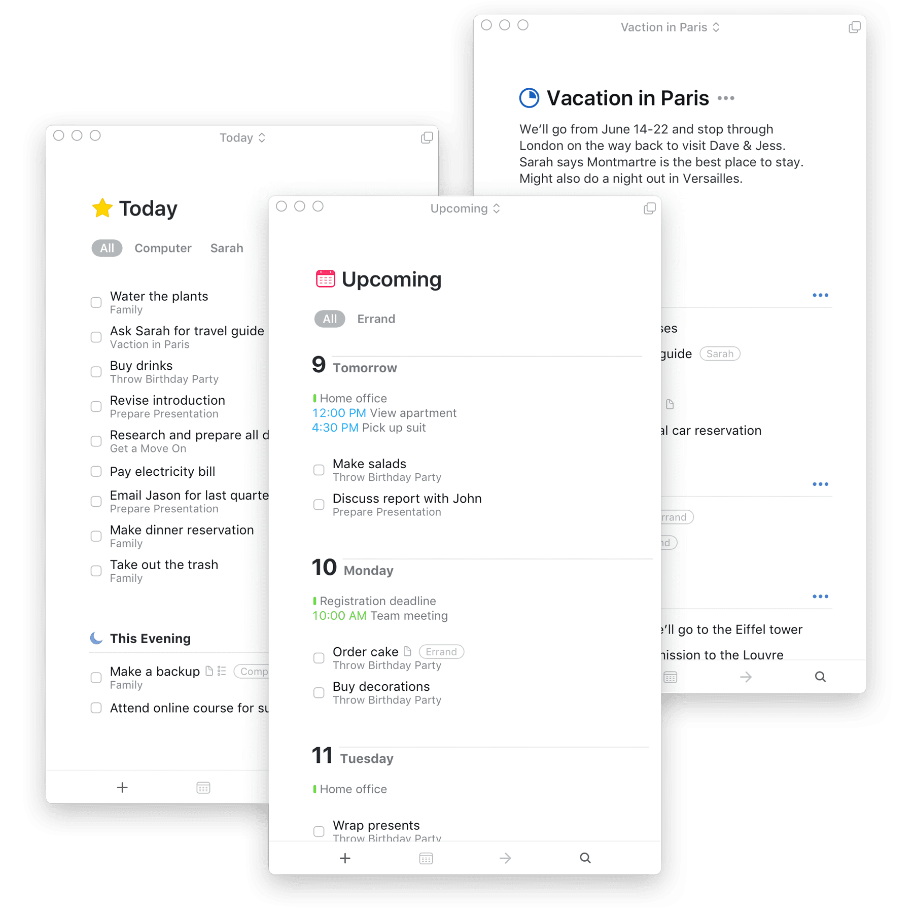
To capture tasks quickly — Things 3’s Quick Entry is instant.
To see what matters today — The Today view is perfect.
To trust the system — If it’s in Things, it won’t be forgotten.
To feel calm, not overwhelmed — This is where Things 3 wins completely.
That’s it. That’s the whole job. And Things 3 does it better than apps with ten times the features.
The Cult of Simplicity
There’s a reason Things 3 has a cult following. It’s not because users don’t know about alternatives. It’s because they’ve tried the alternatives. They’ve done the dance. And they’ve come back.
Not because Things 3 is perfect. Not because it has everything. But because it has enough — and nothing more.
In an age where every app is trying to become a platform, Things 3 remains stubbornly, beautifully, just a task manager.
And maybe that’s exactly what we need.
The bottom line: Things 3 doesn’t compete on features. It competes on feeling. And in 2025, when every app is screaming for your attention with AI bells and collaborative whistles, the quiet confidence of Things 3 isn’t a weakness.
It’s the whole point.
Still using Things 3 in 2025. Still not sorry.
Read my earlier blogs on Things 3 (Comparing to other gold-standard to-do lists app)
Thanks for reading.
Keep reading, Keep sharing.
Stay Productive,