
I Deleted My To-Do List and Replaced It With Three Empty Lines
*Why I'm building a productivity app that fights productivity culture*


Hey friends,
I want to tell you about something I’ve been building. But first, a confession.
I have no degree or experience in software building, programming or designing. This prototype is actually an idea that I wanted to further build on and made with Claude and Loveble. If anyone of you would like to share any insights on development idea’s, do share. Every idea and input is welcomed.
I have a problem with to-do lists. Not in the cute, relatable “oh I have so many tasks” way. In the way where I’ve spent actual years of my life shuffling items between apps, color-coding priorities, and architecting elaborate systems that I use enthusiastically for eleven days before abandoning them entirely.
Todoist. Notion. TickTick. Apple Reminders. Things 3. A paper bullet journal. A whiteboard in my office. Sticky notes. The Notes app. Slack messages to myself.
At some point I realized I was spending more time organizing what I needed to do than actually doing any of it. The tool had become the task.
So I asked myself a question that felt almost too simple: What if a productivity app only let you do three things a day?
Three Tasks. Two Check-ins. One Week.
That’s the whole pitch. Let me break it down.
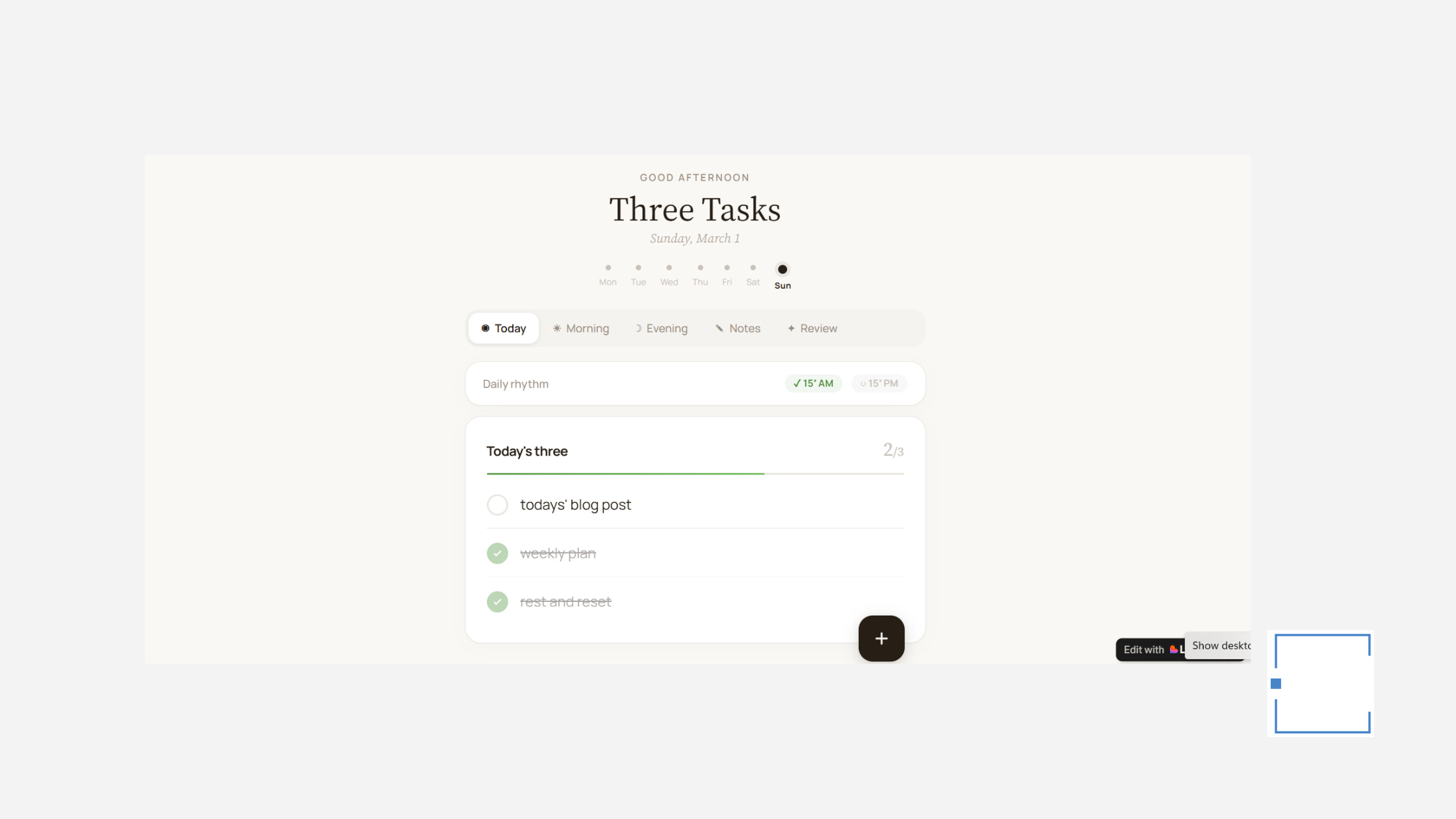
Every morning, you open the app and see three empty slots. Not three categories. Not three projects with sub-items. Three lines. You write down the three things that matter most today, and that’s your morning planning done.
You also get space for a one-line intention (”Stay patient in the afternoon meeting”) and, if you want, loose time blocks for your day. The whole morning check-in is designed to take fifteen minutes. Most days it takes five.
Every evening, you come back for another fifteen minutes. You note what went well, do a quick brain dump of anything still bouncing around your head, write a sentence or two of reflection, and log your mood. Not a score. Just an honest emoji-level check-in with yourself.
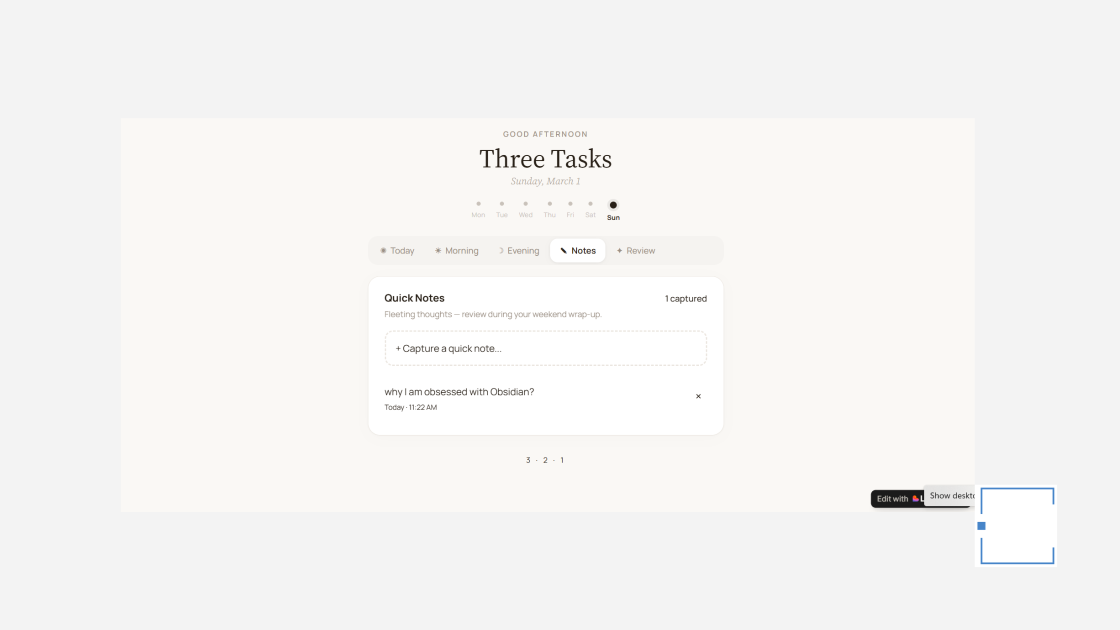
Throughout the day, there’s a quick-note capture button — for the ideas, the random thoughts, the “oh I should remember this” moments that normally get lost in twenty different apps. These notes sit quietly until the weekend.
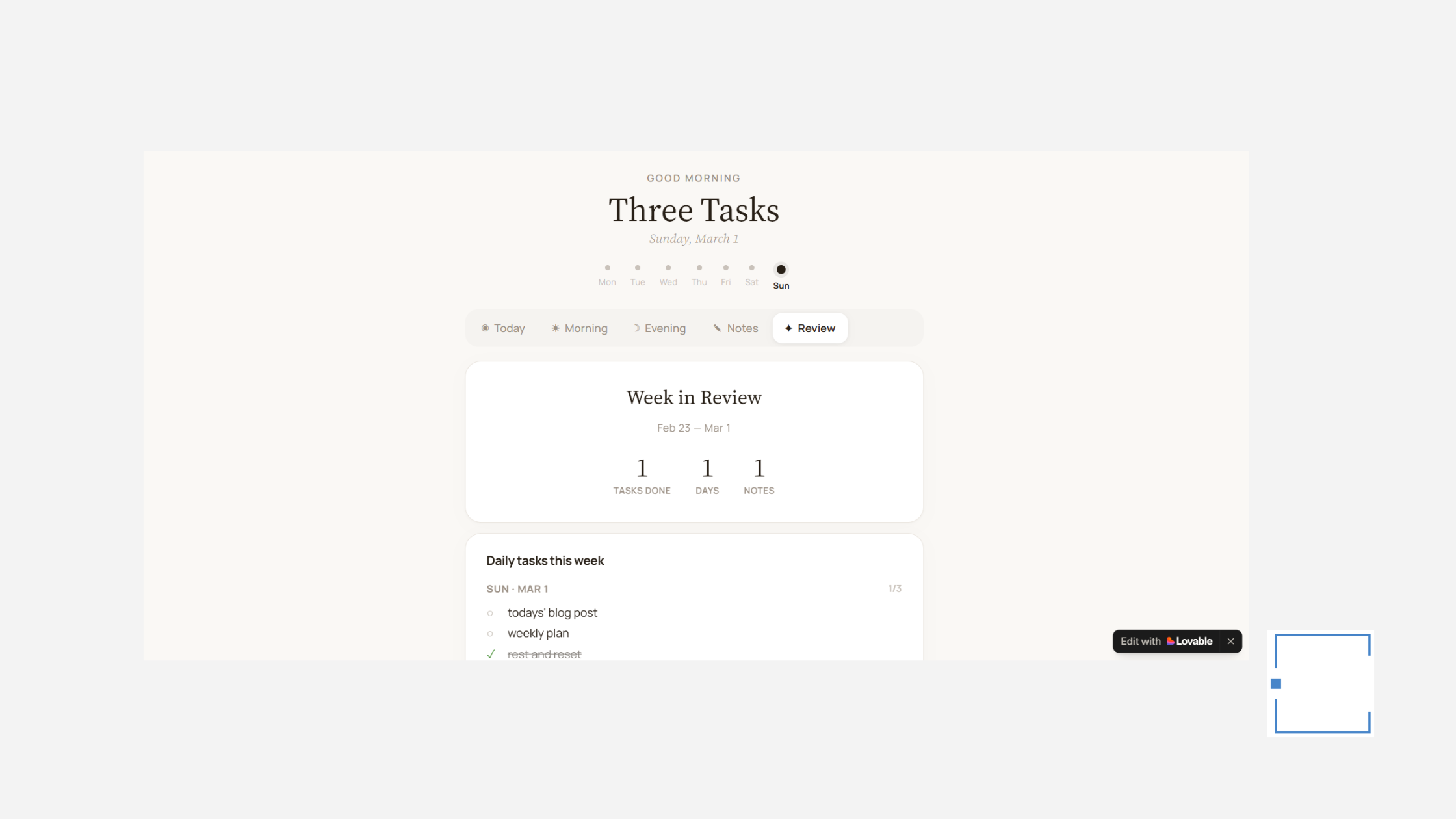
Once a week, everything surfaces in a calm review. Your tasks across all seven days. Your captured notes. Your mood patterns. A space to write a short note to next-week-you.
That’s the entire system.
Why Three?
I tried five. Five felt like a short to-do list. I tried one (the “one big thing” approach). One felt too restrictive on days with genuinely different priorities.
Three is the sweet spot. Small enough to remember without checking your phone. Large enough to cover different areas of your life. And — this is the crucial part — achievable enough that you finish most days feeling like you won.
That last bit matters more than you think. Most task managers are infinite scroll lists. You never reach the bottom. Your day ends not with completion but with a reminder of everything still undone. Three Tasks is designed so that every evening, you look at three checked boxes and think: I did what I set out to do.
The constraint isn’t a bug. It’s the entire product.
The 30-Minute Rule
Here’s my personal rule for Three Tasks: I never spend more than 30 minutes a day inside the app. Fifteen in the morning. Fifteen at night. Maybe a few minutes in between to check something off or capture a note.
This is a direct reaction to what I call the “productivity app trap” — where the tool demands so much maintenance that it becomes its own project. I’ve literally had tasks on my to-do list that said “reorganize to-do list.” If that’s not a sign something is broken, I don’t know what is.
Three Tasks is designed to be the app you open, use, and close. It’s not a second brain. It’s not a life operating system. It’s a daily practice that takes less time than making coffee.
What I’m Stealing From (And What I’m Rejecting)
The design inspiration comes from two apps I deeply admire: Things 3 and Joi Planner.
From Things 3, I’m borrowing the belief that a productivity tool should be beautiful, opinionated, and calm. No visual clutter. No feature bloat. Every pixel earns its place.
From Joi Planner, I’m borrowing the idea that daily planning should feel like a mindfulness practice, not a project management exercise. The morning and evening check-ins are closer to journaling prompts than task management.
What I’m deliberately leaving out is everything else. No folders. No labels. No integrations. No recurring tasks. No AI suggestions. No streaks or gamification. No infinite backlog lurking behind a “Someday” tab.
If something is important enough to do, it’ll be one of your three tasks on the day it matters. If it doesn’t make the cut, that’s useful information too.
The Weekly Review Is the Secret Weapon
Honestly, I think the weekly review is where Three Tasks earns its keep.
Most people I know (myself included) go weeks without stepping back to look at the bigger picture. We’re so busy managing daily fires that we never ask whether we’re even pointed in the right direction.
The Three Tasks weekly review isn’t a performance report. There are no productivity scores. No charts comparing this week to last week. It’s more like flipping through a short journal:
Here’s what you did this week. Here are the notes you captured. Here’s how you felt. What would you tell next-week-you?
That last prompt — “what would you tell next-week-you?” — has become my favorite part of the whole app. It forces a kind of self-honesty that no task manager has ever given me.
Building in Public
The first version of Three Tasks is already live at three-tasks.lovable.app. I built it with Lovable, and it’s rough around the edges. The design will evolve. Features will be added slowly and reluctantly, because the whole point is restraint.
I’m sharing this now not because the app is ready, but because the idea feels ready. And I’m curious whether it resonates with anyone else — whether there are other people out there who are tired of productivity tools that make them feel less productive.
If you want to follow along as I build this, hit subscribe. I’ll share updates here: design decisions, what I’m learning from using it daily, and the inevitable moments where I’m tempted to add “just one more feature” and have to talk myself down.
The TL;DR
I’m building a minimalist daily planner called Three Tasks. The rules are simple:
→ Three tasks per day. No more.
→ Morning check-in: 15 minutes. Set your intention.
→ Evening check-in: 15 minutes. Capture what happened.
→ Quick notes throughout the day for stray thoughts.
→ Weekly review to connect the dots.
→ Total daily time: ~30 minutes.
The thesis is that most of us don’t need better task management. We need less of it — done more intentionally.
If that idea speaks to you, I’d love to hear what your relationship with productivity tools looks like. Reply to this email or leave a comment. I’m genuinely building this based on what feels true, and I want to know if it feels true for you too.
Until next time,
Three tasks. Two check-ins. One calm week.
P.S. — If you try the app, be warned: staring at three empty lines first thing in the morning is more confronting than any 47-item to-do list. In the best possible way.